PJ Trade Centre
This is my new favourite monolith. KL has plenty of monoliths but most of them pretend not to be monoliths by adding twee roofs, useless concrete ledges or bands of insipid coloured paint. Seen from the encircling motorways, the PJ Trade Centre presents four in-your-face slabs of dull grey concrete.
The slabs look banal from a distance but something makes you do a double take.
Firstly the blocks are not so lumpy as usual. From the side they are slender, not quite elegant but ugly neither. A slender tower is a sign of a shallow plan and for sustainable design this means potential for good natural lighting and natural ventilation.
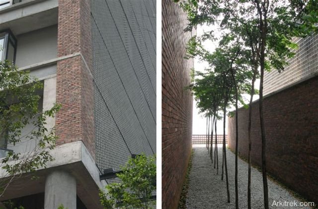
Secondly there is a texture to the concrete that begs the architectural geek to take a closer look to find out what the material is. It turns out to be precast concrete vent blocks.
Three of the four blocks have their entire west elevations clad in concrete vent blocks. Behind this translucent screen is a generous metal access deck balcony. To me this makes excellent sense. The west elevation receives the most sun and so this is the most useful place to put a light and air permeable barrier to reduce solar gain.
If this is rational then it is slightly irrational that the fourth block uses unshaded glass on the west elevation (although it still has a vent block screen less usefully on the south and east elevations).
The marketing blurb is full of architectural bullshit; including that the texture of the vent blocks is inspired by traditional Malaysian weavings of batik, kain songket, pelekat and tenun. I don’t quite buy this but don’t deny that the effect is dully delightful.
As you get closer, more of architect Kevin Low’s detailing comes into focus and gives the building a richness that belies the banality of it’s first impression. I like the honesty of the unfinished brick and concrete and the way it manages to meet the ground without clutter.
Was I erring toward architectural bullshit in that last paragraph? Perhaps;)
The final touch is the elegant landscaping by Seksan Design. It’s just trees and a lawn and brick paths, but we’re talking hardwood trees rather than palms and that’s a thumbs up in my book. Have you ever tried enjoying the shade of a palm tree? You’d be better off tying a hankie to a broom handle.
We didn’t manage to sneak into any of the office suites (the building is not yet occupied) but did have a look into some of the ground and first floor reception areas. I was disappointed that for an air con building there was no evidence of thermal insulation or air sealing.
The building lacks rigour in the application of sustainable design principles but perhaps that is not its main objective? Nonetheless it’s a brave departure from the norm of too much glass, too little glass, too much solar gain and too much air conditioning.
Tenants of the PJ Trade Centre have the option of controlling their own air con. Not everyone in Malaysia wants to work in offices that are cooled to below the legal minimum temperature that buildings are heated to in the UK. This is what happens in centrally air conditioned offices.
So thumbs up for demonstrating so forcefully the concept of passive solar design and a good effort at a place specific high rise commercial building.
Related posts



Pingback: Petaling Jaya Trade Centre | mirage.studio.7
i dont like this building.. seem like Damansara Perdana is part of Bangladesh township.. it is out of local context.
im nixon, come from PJ college of art and design. now i doing my final project about the office interior design,i very need ur help, anyone have layout plan for pj trade centre?
if have, pls email me, dannychow1761@hotmail.com
thank a lot
Hi Nixon, you could try contacting the PJTC Sales & Marketing Dept
http://www.pjtradecentre.com/lease.html
Or perhaps the Architect
http://www.small-projects.com/
Thanks. Ian
Hi, I found your site is impressive and i visited PJ trade center last week. Being a sustainable office building, i believed they did a good job, i.e. sky garden, individual outdoor belcony and semi-open-air washroom for office lot. And I like to know more about your firms project, specially those in sabah. Keep the good work. I will visit this site often. CHeers!
Angeline, thanks for the comments. This post is one of the most read on my site so the building is obviously generating a lot of interest and hopefully stimulating debate about regionally specific sustainable design.
Drop us a line on the contact form if you want to get in touch
Regards
Ian
this is out of the norm, brave and inspiring design. this piece will surely change Malaysians perception towards an architecture. buildings do not have to be covered with expensive granite, marble or cladding to be ‘beautiful’. PJ Trade Centre will surely change the developing country’s crapitecture context.
Should definitely go to one of kevin mark low’s talk instead of blurting out inconsiderate comments. Not responding to local context? you must be kidding. Do not judge solely based on the facade, study why he did so. This building has more contents over form than any buildings in malaysia. The programmes and responses makes a building interesting, not form.
I have been in the buiiding before, the interior is really well-ventilated and the daylight is soft and does not cause glare when it fall on roughly crafted wall, it is very comfortable. I’m actually more interest on how the design deal with heavy downpour in malaysia, does anyone have any idea or photo showing the solution on the building ? Does the rain come in directly or it actually does not come into the building at all ? my curiousity came fram the breathable wall facade, does it really stop the rain from penetrating directly ?